What is the Pareto Principle and How Can We Apply it to UI/UX Design Research?
A few years ago I stumbled across an amazing blog post on MeasuringUsability.com by Jeff Sauro, and had an epiphany. He had outlined the way he was conducting Pareto Principle-based user research, and I realized that I could modify what he was doing to obtain data that my organization had been struggling to uncover.
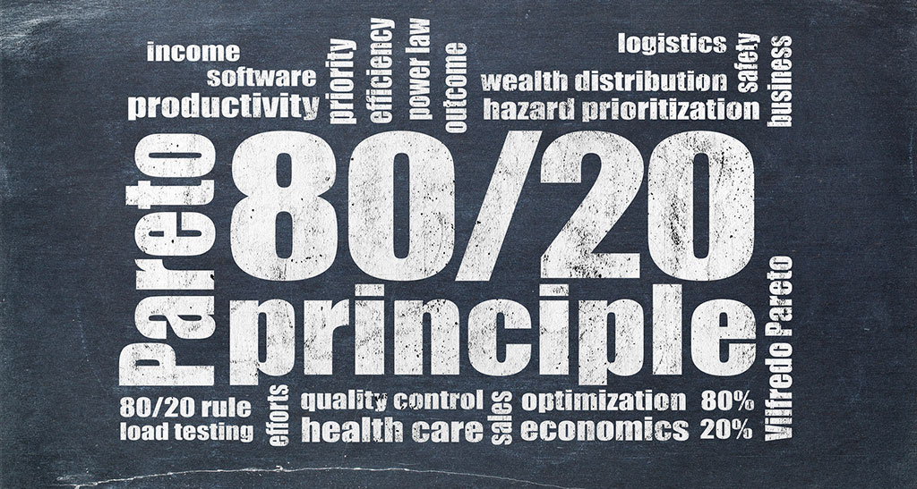
What is the Pareto Principle?
In Richard Koch’s book The 80/20 Principle: The Secret of Achieving More with Less, he details how in 1897, a brilliant researcher named Vilfredo Pareto discovered that the majority of the wealth in England and other countries was predictably controlled by a small minority of the population. Pareto’s research is also known as the 80/20 rule and the Law of the Vital Few, among other names.
In the early 1900s, Joseph M. Juran discovered Pareto’s research and realized that the concept also applied to tons of other situations in life: a tiny percent of criminals caused most of the crime, a small percentage of dangerous processes caused a majority of accidents, etc.
He also realized that the concept could be applied to improve consumer and industrial goods. He created a consulting service to work with companies to identify top areas they could improve upon to make the most impact with product enhancements.
Linking the Pareto Principle to user research
By applying the Pareto Principle to user research, you can identify the top percentage of your product’s usability issues and feature gaps, then jump in and fix them.
Imagine if you could make a tiny code change and vastly improve your product UX. Oftentimes, you can.
In my case, the principle was startlingly accurate. Our research showed that 18% of our core product areas were causing 83% of our clients’ frustrations.
Would a statistician or professional researcher cringe and shed some tears if they saw the method and data I’m about to show you? Absolutely. We aren’t even calculating standard deviations here. But does the average stakeholder care about that? Nope.
This method is for those who don’t have a background in research or statistics, or for experienced professionals who just need some quick and dirty data. It’s a powerful, fast, and cheap way to quickly evaluate how you can pack the most UX punch when you’re planning improvements to your product or service.
Enough talking—let’s start doing. I’m going to outline all of the steps you’ll need to take to replicate this research for your organization.
The research process
Step 1: Recruit research subjects
Do you have a list of your users? Email them and ask if they’d be interested in joining a “special community of customers who will have the opportunity to impact future changes to the product.” You don’t have to pay research subjects—just being able to leave their fingerprint on the product is often more than enough motivation to get people involved in the research process.
In this case study, we didn’t pay our subjects a dime. They were all excited to be part of the community, and they gave us candid, brutally honest feedback.
Step 2: Create your survey
Making a survey is inexpensive–possibly even free–with Google Forms, or a tool like Survey Monkey.
You’re going to ask exactly 2 questions in your survey:
- If you could change one aspect of our product, what would you change? (Provide a list of all core content areas and allow only one selection. Do not include an other option.)
- How would you change it, and why would you make that change? (Make this question open-ended.)
Step 3: Launch your survey
To launch your survey, you can use a plain old email list, or you can get a free subscription to a service like MailChimp.
I prefer MailChimp—and here’s why:
- Intuitive dashboard
- Great for tracking open rates, click rates, and other fun stats
- Easily create lists and groups
- Simple campaign templates
- Unsubscribe/spam rules are handled for you
Step 4: Analyze your data
After you launch your survey campaign, you’ll be flooded with responses—and data! Don’t get overwhelmed—analyzing the data isn’t that intense.